
![]()
![]()
![]()
![]()
![]()


Presentation Graphics
Effective
presentation graphics provide presenters with dynamic speaker support,
helping to
convey complex concepts and ideas through compelling
animations and interactivity in the form of sophisticated digital
productions. These
presentations may feature a variety of media elements including video clips,
background music, sound effects, animations, interactivity, and other strategically-designed graphics.
In order for designers to create successful presentations, opportunities are identified to leverage graphics to persuasively communicate and instill your ideas in the minds of the audience.
Most people will respond better to visual presentations than to text or speech alone. Consider that:
People acquire 75% of their knowledge through visual input.
The use of visuals can reduce meeting times by as much as 28%.
A picture is 3 times as effective in conveying information as text by itself.
Ranging from formal, slide-show-style presentations to animated, interactive game-shows, quality presentation graphics can take many forms, providing audiences with unique insights into topics ranging from very simple to extraordinarily complex.
 Persuasive
Visuals
Persuasive
Visuals
When designers introduce visuals, presentations can
be more persuasive, interesting and involving, you can cover
more material in less time, and audience retention and comprehension are
greatly improved. Our visual design process consists of four steps:
Targeting, Concepting, Composition, and Development.
Targeting selects
the intended platforms and defines audiences/buyer personas. Concepting consists
of rapid creative brainstorming,
cycling through ideas and strategies. Composition is taxonomy
design, or descriptive assembly of content requirements and structure.
Development
combines the right language with descriptive visuals to enable our
designers to achieve a
meaningful end product.
Here are some basic rules to improve the impact of your presentation graphics:
Be concise, limiting on-screen text to 25 words or less for each graphic. Visuals with a great deal of text tend to be more distracting, taking focus away from your target message.
Create visuals containing a high level of contrast to improve readability. For example, consider using light-colored typography and artwork against dark backgrounds, particularly when projecting your visuals.
Develop clearly-stated headlines, no more than 8 words long, the shorter the better. Use a subhead if you need to be more descriptive.
Headings should appear in a larger and bolder font than subheads and body copy.
Proof your visuals for spelling, grammar, context, goal messaging, and overall readability. If possible, enlist the help of professional proofing or design services (or at minimum, recruit an uninvolved co-worker) since it’s extremely difficult to accurately proof your own work.
 Typography
Considered
the art and technique of arranging type in order to make language
visible, typography includes the selection of typefaces, point size,
line length, justification, leading (line spacing),
tracking (adjusting
spaces between groups of letters), and kerning (adjusting the space
between pairs of letters). The visual appearance of type has a
significant effect on how a message is perceived. Fonts create mood and
atmosphere, and often provide visual cues as to document structure,
navigation, and select content importance. The
designer's goal for
good typography is to produce text and graphics which are composed to
create a clear, visually pleasing message.
Take into account the following when selecting type fonts for your presentation:
Use sans-serif fonts for increased readability. Sans-serif typefaces are commonly used for headings and titles, and can provide contrast with a serif font chosen for the accompanying text.
Use system-standard fonts to
minimize undesired playback system issues.
(For sans-serif
consider Arial, Helvetica and Tahoma; for serif try Times Roman,
Palatino, or Georgia.)
Avoid fonts with overly thin strokes that may disappear when projected.
As a rule, keep your type displayed at 24 points or larger (no smaller than 18 points).
Never mix two different typefaces within the same font category (e.g., a sans serif font with another sans-serif font). Best design practices dictate the pairing of one serif font (for the body copy) with one sans-serif font (for the heading), or vice-versa.
Use master pages for consistency in type size, style, placement, and color applications.
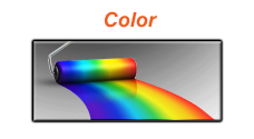
Use color to draw attention, focus, differentiate, evoke a desired emotion, or set the mood.
Oranges and yellows are considered warm colors, creating feelings that are sincere, upbeat, and optimistic.
Cool colors include blues, greens and violets, creating feelings that are gentle, serene and calm.
Include no more than two vibrant colors in your palette for emphasis.
Select colors that effectively convey your message.
Avoid using red and green together, since 10% of men and 5% of women are red/green color blind and can’t easily distinguish between the two.
If you plan to project your presentation, use saturated colors with high contrast for easier readability.
Early in development, test and adjust your colors for desired playback on the target presentation equipment.
![]()

Graphics
The effective use of persuasive artwork makes the presentation of
conceptual, complex, or detailed information more interesting
and straightforward to comprehend. These graphics include clip
art, photographs, 2D and 3D animation, videos, tables, charts,
and graphs.
Graphics should be used sparingly, with the specific goal of increasing the understanding of your concept. Consider the following:
Your artwork should present a single, consistent style.
To keep file size low and picture quality high, use jpg files for photographs.
Produce orderly graphics. Keep it simple and well-structured to increases understandability.
![]()
Animation &
Interactivity
Employing creative animations and functional
interactivity helps your audience become engaged,
maintains their attention, and greatly improves their ability to
remember the essentials of your presentation. Developers
utilize these
techniques to help people understand complicated ideas,
hierarchical relationships, or physical layouts. These visuals
can also be active indications to your audience that you are
progressing to a different subject.
Recent studies demonstrate that audiences viewing visually stimulating presentations have significantly higher retention rates and increased levels of engagement. Concepts reinforced through thoughtfully executed visuals greatly assist an audience’s overall understanding of the intended message.
Developers can design presentations to integrate with interactive
hardware elements that involve an audience, for example
using audience response systems, or facilitating world-wide
conversations and interactions via live web conferencing. Other
integrated hardware devices, including digital laser pointers,
highlighters, and interactive whiteboards, can help improve live
presenter performances.
![]()
Keep it Simple
To
convey your ideas effectively, consider developing visuals that:
are simple, on-point, and easily understandable
reinforce or help to communicate your concept
display important terms (as opposed to full sentences of text)
It’s much easier to write verbose text to describe ideas than it is to be concise. Upon completion of your first draft, return to your presentation and use the following ideas to help refine your message:
reduce unnecessary visuals – non-essential clip art, and other extraneous elements
remove complete sentences – replace them with strategic words and phrases
simplify and unclutter visuals for improved audience readability
maintain open space (white space) for increased readability and reduced audience distractions
The following three best practices provide simple ways to increase understandability:
focus on a single concept for each slide
use photos, clip artwork, and tasteful color (where appropriate)
apply bullets to listed items (for sequential items, use numbered lists)
forward-thinking visuals often result in increased engagement
improved audience retention enables improved understanding of difficult concepts
structured message shaping simplifies presentation of complex viewpoints, multifaceted concepts, or chronologically-built ideas
presenter anxiety is significantly lessened with strong speaker support
well-presented content imparts credibility to the ideas illustrated
![]()
![]()
The use of color plays an important role in our visual perception of concepts and ideas, as it influences audience reactions on both a psychological and an emotional level.
For example, Blue is the color of the sky and sea. It's often associated with depth and stability, symbolizing trust, loyalty, wisdom, confidence, intelligence, faith, truth, and heaven. Green is the color of nature, symbolizing growth, harmony, freshness, and fertility. Green has strong emotional correspondence with safety, and is commonly associated with money. Red is the color of fire and blood, so designers often use it to represent energy, war, danger, strength, power, and determination as well as passion, desire, and love. This understanding of color perception must be considered when designers create color palettes with the goal of stimulating desired audience reactions.
The following guidelines offer best practices in applying color to your presentation graphics: